Thursday, March 3, 2011

Entry 8

Ye sculpture week! I love sculptures. Especially sculptors you can paint on. Anyway, This is a relatively work heavy so ill cut to the chase and get down to business.

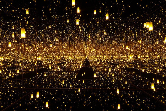
Our guest speaker for this week was Amanda Wojick. I found a very interesting person because she went from wanting to become a pediatrician to an artist. Talk about the opposite die of the spectrum. She reminds me of myself. I am a double major in fine art and business administration. I got the impression that Amanda was pro feminism because her lecture were about the 9 most influential women sculptors. This may sound rather embarrassing, but before Amanda’s speech, I have never really knew any famous female sculptors. And I have to say I am impressed with what I saw. My favorite artist has to be Yayoi Kusama. She is living proof that madness is indeed genius. I really liked how she play with space. The use of mirrors reflecting off one another creates an infinite work of art, like a little universe. I wish I was there to experience it myself, watching it through the slides just robs the work of its magnificence.
Another artist that caught my attention was Rachel White read. Like Kusama, Whiteread also focuses a lot on space and how it relates and effects the viewer. She plays around with positive and negative space. I really found her work to be haunting, in a rather nice way. When I think about, she reveals what we can’t see. Her work of the plastered house in London is proof of how powerful her work is. She got both positive and negative reactions. And I personally think its genius, it makes imagine and think about what once there. It is a reminder that nothing lasts, that once, a glorious house stood there. Maybe people didn’t like it because it reminded them every day, that one day they too would have the same fate the house. That they too would disappear and only leave behind a skeleton… and even that doesn’t last long.

After reading a lot about her, and looking at much of her work, I would have to say that Louise Bourgeois is the master of physical space. I love the simplicity in her work. Not all her work is simple, but my favorite ones are the ones that are simple. One of my favorite works by Bourgeois is “A touch of Jane Adams.” My first reaction when I saw this work was “Damn it! Why didn’t I think of that!?” This piece is so simple, yet so complicated! Two pairs of hands holding each other on a rock. It’s really sweet. Now the irony in this was what Louise said about this piece. She was afraid of putting this out in a public space because she feared vandalism. The master of space fearing space itself. I think that how fragile this piece is adds to its beauty. Other than space, Louise tackles abstraction and representation. This piece is both. There is a representation with the technical sculpting of the hands, and the abstraction is that the hands are cutoff and balanced on the center of the pedestal. It has no identity, therefore anyone can relate to this piece.

On the opposite side of the spectrum, is Richard Serra. After looking at his work, I can say that he leans hard towards abstraction. His work is very abstract, and I think it has to do with his work at the steel mill when he was young. A lot of his work is metal and reminds me of factories and warehouses like “Charlie Brown.” The piece that I really liked was “Torqued Ellipses” because it plays so much with space. It invites the viewer to enter the work and be immersed in it. It kind of echoes Bourgeois’s spiders and how they engulf the viewer’s space.

Finally, we had a reading the size of a planet for this week. It was rather interesting because it tackles something so simple, looking. Elkins talks about the difference between seeing and looking. He writes “Seeing is effortless and mercurial, or so it seems, and it appears we prefer it that way. But we cannot forget the harshness and the pressure of seeing. Seeing is at the very root of our way of getting along with the world, and a single look can have all the force of hatred and violence that may be expressed in more brutal ways.” I never thought of looking and seeing as being different. But now that I think about it seeing is what we do to function every day, but looking is what we do when we judge. The author argues that one can’t “just look” at something. One looks at something for a very good reason like it interests them or is making observations about it. I totally agree with him because I personally don’t believe that I just look at something. God gave me sight and I will not use this sight to “just look.” The author talks about this when he talks about how shoppers shop on page 19. He talks about how they bend forward and lean backward, make faces and raise eyebrows. And when they are asked if they need help they answer “just looking.” That is a total lie. After all that effort one can’t just look. You examined it, studied it, observed it, then judged it and move on.

There definitely are many overarching themes this week. The reading, “Just Looking,” sums up how I have been looking at these works. I wasn’t seeing any of the work but rather looking at them and judging them. For example, I liked Kusama’s work because I thought it was beautiful and I took the time to look at it, I did not just look. And what all the artists had in common I think was both playing with physical space, space related to the viewer. Kusama used mirrors to cast and illusion of infinite space which made the viewer feel insignificant. On the contrary, Bourgeois’s spiders and Serra’s ellipses encompassed the viewer and made them feel claustrophobic and vulnerable. Rachel Whiteread used space to make the invisible, visible. It’s interesting how everyone has their own interpretation of space. Finally, these artists all played with either abstraction or representation. Each field has its own effect with relation the viewer. For example, Bourgeois’s “A touch of Jane Adams” leaned towards representation because it clearly depicts intertwined hands while abstraction would be more like Richard Serra and his steel works that remind me of mazes and rooms.

My visual response for this week is “Arc” by Richard Serra. I find this piece hilarious cause it pissed so many people off. It literally was a huge steel arc that was an “eye sore” (that’s what people called it ) and it got in the way of people crossing the plaza. People had to walk around it. It’s a very funny way of playing with space, people didn’t find it “playful” though. 

Thursday, February 24, 2011

Entry 7

                Surprisingly, after a material dense week, this week was kind of like a break. There aren’t many topics to talk about and so it can give me a chance to go into specifics regarding the two topics for this week, our guest speaker Anya Kivarkis and our weekly artist John Feodorov.
                Anya talked about a lot of things in her lecture. The lecture revolved around jewelry, metal smiths, and other forms of craft. I always thought that arts and crafts were synonymous. Until recently, I never questioned why it was called “Arts and craft.” Now that I think about it, art, in hierarchal terms, is perceived as being higher than craft. And art is more precious and valued more than craft, which is more of a commodity, something that satisfies a need. Anya talk a lot about this in her lecture. One example is the painting titled “Oil on Aluminum” by Marilyn Minter. I found this painting interesting because it is controversial and ironic. It shows a woman splashing in a puddle of mud in what appears to be designer shoes. Minter questions and smudges the line between art and commodity. Are the shoes a commodity because they satisfy the need to protect ones foot? Or are they are because they are adorned in jewels and carry a designer label? And if it is art, why is she splashing through the mud with them? The medium she used is also significant. Paintings are the traditional form of art, and are automatically labeled as art but it is depicting a craft or commodity which is contradicting in a sense.
                Another piece that Anya talked about was by Kim Buck. This piece is a gold tube that is shaped like a ring. People pay certain price to get a portion of this ring. One can pay a whole lot of money and get a good chunk of the gold ring or pay a small amount and receive a thin sliver. This again questions the issue of hierarchy. It separates people based on wealth. I am talking about this piece as a work of art but in reality it is a craft because it satisfies a need; a need for greed. It is mass produced, which reduces it preciousness, yet it is made out of gold. I think that this piece is both a work of art and a craft. It holds elements from each but doesn’t fall only in  single one.
                Feodorov is one interesting character. He was brought up in the suburbs in Los Angeles and a Navajo reservation in New Mexico. His upbringing and heritage has an obvious effect on his work. One piece a loved and found really amusing was “Totem Teddies.” He took a bunch of bears and put sacred masks on them. In his interview he said “Behind these masks are cuddly cute faces. Its turning these teddy bears  into powerful totem symbols sort of giving them back their power. But also they would be products the consumers could buy, so at the same time it would be stripping them of their power. That just sort is an example of the issue of commodifying the issue of spirituality.”  I totally agree with him and I love how he played around with this piece to express this ambiguous message. He took something totally sacred and made something the one can purchase, like a teddy bear. I think its brilliant, not because it’s funny but because it really wakes people up. It wakes people up because it shows that some things can’t really be bought, like spiritual enlightenment or moral values.
                There definitely is an obvious connections between Feodorov speech and Anya’s lecture. Anya talked a lot about preciousness, hierarchy, and commodity. Feodorov expressed what Anya talked about in his work. Teddy bears are a commodity, they fill the need for comfort and love. Totems are spiritual objects used for religious practices. Put the two together and you get nothing. A commodity can’t be precious, it’s like dividing by zero on calculator; you get a syntax error. And that is exactly what Feodorov did. He took a commodity and made it precious but in reality it is none. Religion these days has become a commodity unfortunately. Religious enlightenment is found in mass consumerism. The more we buy the happier we get… right?
                My response for this week is Marcel Duchamp’s “Fountain.” It’s perfect! I mean he took a freakin urinal signed it and make precious. It is like the opposite of Fedorov what did. Instead of making a something precious a commodity, he made a commodity something precious. And pissed off a lot of people in the process as well. And a century later, we still talk about him.

Thursday, February 17, 2011

Entry 6

                This was one tough week. I really found it hard to grasp a lot of the material. I’m gonne give it my best shot and hope I do a good job.
                Our guest speaker for this week was Carla Bengston who is the associate professor of painting and drawing here at the UO. I was excited when I heard its going to be painting week because I see myself as a painter and was excited to see a professional in that field give a lecture. I was disappointed to see that most of the work was not painting but nonetheless enjoyed the presentation in general. What really caught my attention was when she ask “Is a work more powerful it is political or more subtle?” In my opinion, I think that work that is more political is less powerful than work that is more subtle. This is because I think the author takes the spotlight and usually I forget about the actual piece. While work that is not political tends to take a life of its own and the artist is left in the background.
                In the end Carla showed us some of her work and it fascinated me because it was “unplanned.” Her ant paintings I thought were very original, I have never seen something like that done. And then to recreate them large scale made them seem so abstract and just fun to figure out the movement and path of the ants took. Another piece I liked that she did was when she caught up tiny pieces of paper and threw on the ground to have them interact with the ants. I liked that piece because it was something that Carla had no control over, and the piece itself took a life of its own. It was interesting to see the interaction and controversies the ants had with the pieces of paper.
                The reading for this week was torture. I read it, and read it again. Instead of things getting clearer, they got hazier. However, I did understand the main point the author was trying to make. Roland Barthes was asking the question of whether a piece of work can stand on its own merit or does it really matter what the author/artist think? What I understood is that the artist or author does not hold the key to interpreting the piece. And as soon as the viewer interacts with that piece and develops their own meaning of it, it does not matter what the author thinks; thus the author dies. I found it ironic that Barthes writes this piece of work explaining how the author dies, and when I read it he died. I might have interpreted it wrong and thus what he thinks is no longer relevant.
                Finally, our featured artist for this week is Kiki Smith. Smith is a sculptor and drawer. Looking through her work I found that it had a lot to do with human interaction with animals. When I was watching one of her videos I really like her explanation of what is art. “Art is something that moves from your insides to the physical world.” I can relate to that because I have a hard time expressing myself with words. “It’s like standing in the wind and letting it pull you whatever direction it wants to go.” I agree with her. I think the best kind of art is unplanned. You start with an idea, and as you begin creating you discover something a lot more interesting and decide to go with it. Even though I like her thinking, I dislike her work. I found it discomforting because a lot of it had religious themes and death. I didn’t like because its stuff I have seen before from other artists. I didn’t find anything that I would look at twice. Perhaps I misinterpreted it, perhaps not. I’ll never know.
                Ok now to put everything in a nutshell. A really big nutshell. Everything that I talked about is interrelated. “The death of the Author” is echoed by both Carla and Kiki. The way I interpreted Kiki’s work and the discomfort I felt was because the artist is dead. What I felt and what I thought could have been something totally different than what Kiki intended. When Carla asked the question about what makes a piece powerful, my opinion took a life of its own. Looking at Carla’s work, I found it to be playful and original. The guy sitting next to me may have disliked it. Carla may have been making a political statement. It doesn’t matter what we all think, what matters is us, and how we feel; everybody is dead.
                I also found that Carla's and Kiki’s ideas are very similar. Kiki said that art was like standing in the wind and to let it guide you. This was exactly what Carla did with her pieces. She just went with it. She did brush of the ants, she made the ants the artists and just went with it. The piece with green papers would have failed if the ants to take part of it. It is the unplanned that makes things special.
                 My visual response is a Natalie Dee Comic. I can never tell her tone or what she means with her comics, which sums up what I was trying to say above. And I think I'll leave you hanging with this awkward comic. 

Thursday, February 10, 2011

Entry 5

            Our presenter for this week was John Park. I really liked his presentation because it was engaging and because I can relate to him. He said that he used to sit where we sat in the same lecture hall, and it just was so motivating. One of the key parts to his presentation was when he began to talk about the problems of technology, specifically the zombies part. I totally agree with him, that we as a human species are becoming less human and more robotic. I for one don’t like where we are going. Technology is developing at an exponential rate and we have become so dependent on it. When I really think about it, we really are living in a zombie apocalypse. Every day when I walk down 13th, I dodge people who are not watching where they are going because they are texting; once I even saw a dude on a bike texting- with both hands. I wanted to throw my shoe at him. When I go home, my roommate is staring mindlessly at the TV playing some online game on the PS3. They are everywhere. Sure, I use technology but I regulate it. I’m just glad they don’t have a craving for brains. Sometimes I wish for more human interaction rather than texting someone or facebooking them. We are a very social species, we need to interact with one another rather than with a piece of plastic.

                That being said, I don’t mean to say that technology is bad and that we should go back to the dark ages. If used correctly, technology can not only be useful but it can be something beautiful. Something that can make one more human simply by reminding them that they are human. I know what I said was vague, but this is what I felt when John showed us a piece called “I Want You to Want Me.” This piece really moved me because it was so “human.” It was truthful, it showed what men and women really wanted in each other. “In online dating profiles what people do is they talk about themselves in maybe 200 words and they say the most important things about themselves. And so it is a very fertile ground for building a mosaic of humanity.” I thought that was very beautiful. Living in a world where things are not what they seem (ex: make up, photoshoped images, cosmetic surgery) one forgets that they are human and that they have human feeling and needs. I believe that there is a lot of good in the world, one just has to look for it. One can argue, that people can lie about what they say in their profiles, but I think that if one goes on an a dating website, they are really looking for someone because they gave up looking physically. Profiles may be stretched a bit but I think of it as a snapshot of what people desire. It fascinates me.

                Our artist for the week is David Byrne. He has a very interesting installation called “Playing the Building.”  The work is composed of an organ that is attached to a building’s pipes and columns. When the organ’s keys are pressed, it interacts with the corresponding part of the building making various sounds. I really like this piece because it is so clever! It pushes the boundary on what is art. Is the installation the piece of art? Or is it the music being played by the consumer the art? Both maybe? It makes me think and I like pieces that do that. It reminds me of Andy Warhol when he said that in the future everyone will be famous for fifteen minutes. It’s true, when people sit and play the piano they become famous for a little while. I can also see a connection here with John Park and how technology can be used as a form of art. It reminds of the Dj table that he showed us in class. I find that “Playing the Building” and the Dj table (I can’t remember the name) are similar because they are both a common object that has been altered to make it interactive, fun, and beautiful at the same time. These kinds of interactive pieces really bring out the humanness inside us. In his interview Byrne said “I believe we have an innate longing for the spiritual and ecstatic. If we're not getting it in church, synagogue, or temple then eventually we'll locate it elsewhere: at a concert, a rave, Burning Man, or through sports or drugs, or even through some kinds of art.” This search for a greater power is what makes us who we are, makes us human. We just need to be reminded of that.

                Finally, our second artist for this week is Janet Cardiff. Cardiff was different than everything I have talked about. I found her work to be very creepy and spooky. Especially her audio walks. I listened to an audio walk called “Ghost Machine” and it freaked me out. Her voice is so eerie, especially when she whispers. I always feel something loud and scary is about to happen, but never does. It was very suspenseful. I also watched an installation video called “Pianorama.” This installation reminded me of David Byrne’s “Playing the Building” because they were so similar, yet so different at the same time. They both involved a musical instrument and they both played music. However, Byrne’s was a lot more lively and I associated it with humanness and life. On the contrary, Cardiff’s I found to be rather ghostly. When the keys are struck, two voices can be heard discussing a music composition. Their voices are there but their bodies are not. It reminds of death and how transient this life is.


                My visual response this week is an interactive installation called “Wooden Mirror” by Daniel Rozin. I really thought this piece was amazing because it is playful and creative. Who would of thought wood can be used as a mirror? It echoes John Park and the two artists in a sense because it requires consumer interaction, the art piece itself creates ephemeral art (one’s reflection), and it uses technology to make art.

Thursday, February 3, 2011

Entry 4

Well I have to say that this week has to be the most depressing one I’ve had in this class. We focused on photography, and photography always leaves me depressed. Photography is very powerful, but for some odd reason, only the powerfully devastating images are embedded in my mind. And as I expected most of the things I saw this week were depressing- gut wrenching in some cases.

Craig Hickman was our guest speaker for this week. He specializes in photography. I have to be honest; I did not like how he presented. He did not have a slide show and so he relied on the internet. It was hard for me to follow him since his transitions were abrupt  and I didn’t really get a good grasp on the topic. However, Hickman showed us many photographs that I found very interesting. One that really stood out was the picture of the twin girls by Diane Arbus. "Identical Twins, 1967" was a photo by Arbus that was so captivating. There is just something uncanny about it and I can’t place a finger on it. When I look at this piece I get a feeling of discomfort. The girls look you dead in the eye and they have that expression that says “Yeh… the coffee you’re sipping… Yeh we peed in it.” The discomfort I’m feeling is what draws me closer to this picture, I can stare at it for hours.

What I learned from Craig’s presentation was something’s don’t have to be explained. He just bombarded us with an array of photos. Not having something explained by someone else makes me conceive my own opinions effectively. For example, I may hate a piece of art but then someone comes along and makes sense out of it and suddenly it’s a masterpiece in my eyes. I think that I was manipulated to share the same views as the person explaining. So Craig gave me the freedom to like or dislike many of the pieces he displayed.

Errol Morris talks about this more about this in his blog. The explanation or the caption to a picture really has an effect on how one views an image. In midst of the blog, Morris describes photo’s presented by Colin Powell to justify the war on Iraq. My first impressions of the photos was that they seemed something from the military and they were unclear. There were captions labeling things in the photo with words like “decontamination vehicle” and “chemical munitions bunker.” I instantly get a feeling of panic and red flags shot up. As I scrolled down, the captions changed to “International House of Pancakes” which made me laugh. Instantly, I went from a state of discomfort to a state of joy.I’m not an aerial intelligence expert. I could be looking at anything. It is the labels, the captions, and the surrounding text that turn the images from one thing into another.” This made a lot of sense to me and it explained how I felt. Morris goes on to say, “But I do know that the yellow captions influence how we see the pictures. “Chemical Munitions Bunker” is different from “Empty Warehouse” which is different from “International House of Pancakes.” The image remains the same but we see it differently.” This is echoed by Craig Hickman’s presentation, if Craig explained the photographs I’m sure I would have had a different opinion about them. As humans, we are emotionally sensitive. It’s funny how a few fabricated words can justify war.

Moving on towards to more depressing issues, our artist of the week is Alfredo Jaar. Looking through his work I can see that it is about society and politics. His work titled “The Rwanda Project” is one that really grabbed me by the throat. It consisted of 21 pieces that took him six years to make; and they all failed. He says “basically, when we say one million dead, it’s meaningless. So the strategy was to reduce the scale to a single human being with a name, a story. That helps the audience to identify with that person.” I totally agree with him. Numbers are meaningless. Open today’s news paper, some thousand people reported dead, another hundred died in another tragedy. I just got immune to it. I know it seems heartless but every time you watch the news and every time you turn a newspaper page it smeared with blood. I got used to it. But when I hear something happen to a single person, it’s something different, I sympathize with that person. I feel sorrow towards them. It is kind of like how Errol Morris stated “You don’t need sophisticated digital photo-manipulation. You don’t need a computer. All you need to do is change the caption.” In this case, Jaar decided to manipulate the public’s emotion by focusing on a single person rather than a large number of people. Jaar’s piece “The Silence of Nduwayezu” is about a boy who watched his parents get murdered with a machete. I don’t know what to say. I don’t know how to react. This is really hard to express. I think Jaar did a good a job in communicating what he has to say. He created a mound of one million slides of Nduwayezu’s eyes, and his eyes do the talking. The mound as a whole can be seen as a single work. The dark ambience makes me see it as accumulation of sin, of blood, and death. I tried comparing this with Craig’s photo’s but Jaar’s is way too serious while Craig’s is more curious and innocent.

Now I think it’s my turn to share some images that have been burned into my eyes. Whenever the subject matter is mentioned, the corresponding image manifests in my head. Let’s start early, 1989 in Tiananmen Square. A massacre occurred there where large number of people were slaughtered. The corresponding image would be the famous Tank Man. All I can say is “damn the dude has balls of steel.” A very inspiring image indeed. A few decades later, Palestine, A boy throws rocks at a tank. Let me say that again, a boy throwing pebbles at gagillion ton, man-squashing, shell-shooting tank. I don’t know where to start. What the hell is the photographer doing? Why isn’t he getting that kid to safety? Why is that tank going to kill a little kid? What is the kid thinking?! I don’t know what to say or how to react! So many questions not enough answers. Finally, December 17, 2010, Tunisia, a man lit himself. A response to the oppressive Tunisian government. His actions ignited a revolution, forcing the Tunisian president to go into exile. This revolution ignited the Egyptian protests going on right now. A man lighting himself on fire, changed the lives of millions of people. 

Photos from:

Thursday, January 27, 2011

Entry 3

End of week four already, time flew by so fast! This week was great. We got an extension on the blog dead line and no reading (YAY). We had the great pleasure of having Professor Sara Rabinowitz give us a rather interesting presentation on fibers. Instead of the reading, we got another artist to look at this week; Ann Hamilton and Cai Guo-Qiang.

Professor Rabinowitz works in the field of fibers. When I think of fibers, I think of pipe cleaners; thousands of fuzzy pipe cleaners. I was sort of right. Fibers is a field that focuses on weaving different materials (doesn’t have to be fabric) together to form a piece of art. I can never look at pipe cleaners the same way ever again.
The lecture focused on different artists who worked with fibers.

One artist that I found really fascinating was Claire Zeisler. I just fell in love with her work because it was just so beautiful. Her work was exceptional because she wanted her work to stand on its own without any foreign object (metal/wood) holding it up. Just visualizing the labor it would take to force a bunch of strings together in a solid shape is overwhelming, but she was capable of doing it. I thought that was very inspiring and motivating. Claire Zeisler was ahead of her time. Her work seems so modern, so 2011ish. One work that really caught my eye was the red wrapped and twisted fibers coming down from the ceiling. I found this work interesting because not only is it visually appealing, but it is obvious a great amount of labor went into it. The labor itself should somehow be framed and hung next to this. My mom would kill to get this piece of art when she was redecorating the house; I bet she would use it as a curtain.

All this talk about fibers, made me think about home. In ancient times, many people in the Arabian peninsula relied on fibers for survival. They used camelhair to weave together large tents to shield them from the harsh rays of the sun and to make camp settlements where ever they found water. The hair is often dyed different colors, in order to make patterns when weaving the hair together. Today, the camelhair tent is a cultural icon and is still often used. However, people now use it for leisure like going camping out in the desert to get away from the busy city. Others have modernized the camelhair tent by adding lights and metal beams into it and often hold banquets or weddings. I found it interesting how some people use fibers to make art while others used it for survival.

During the presentation, Professor Rabinowitz showed a few slides of Do-Ho Suh. His fabric sculptures blew me away. The precision of these sculptures is phenomenal. He made sculptures using a type of silk to make a ghostly impression of past homes. I quickly built a bridge between this work and the camel hair tents that my ancestors used to live in. They both can be folded, making them portable. And they both were temporary homes. Two different cultures yet similar ideas.

Ann Hamilton made an appearance in Professor Rabinowitz lecture slide show. I found her to be more of a conceptual artist. She explored many ideas using fibers. She demonstrated how fibers did not just revolve around textiles. What I understood from her work is that fibers is about combining many little things to form a whole, and that the process was cumbersome. As usual, I searched through the internet to find examples of her work before I read her biography to give me a sense of what kind of person she is. One image that really stood, out was a piece she did called “Toothpick Suit.” This was also mentioned in her biography. This piece was made out of many tiny toothpicks that she wore. Setting the process aside, it must have been painful just putting it on! I mean, it’s a bold statement showing the pain and struggle that  women bare, especially women working in fibers. This piece reminds me of Kosuth’s “One and Three Chairs” which was conceptual art. Hamilton echoes this piece by having a chair sit on her emphasizing the burden she is carrying.

Cai Guo-Qiang is not what I would think of as a traditional artist. The materials he uses as media are very strange to me. I mean, who would of thought that gun powder - something used to take lives and destroy – can be used in a way to create something beautiful and worth contemplating. It is oxymoronic. I think the gun powder is a cultural icon for China. Gun powder back to ancient times in China where it was used for fireworks and warfare. Guo-Qiang is tapping into his culture to create something modern from something so ancient.

Me standing under Inopportune: Stage One
Also, I finally figured out who did that car crash exhibit I stood under at the Seattle Museum of Art! It was Cai Guo-Qiang (Duh!). When I first walked in the SMA I was struck with awe as I saw real cars hanging from the ceiling. I went to stand under one to have my friend take a picture of me. As I stood there, I was anxious that the car was going to fall on me. I think that this feeling I got was what Guo-Qiang was trying to express. I felt very vulnerable and I was relieved to have moved out of the way. This piece was definitely something different than staring at painting on the wall because I never felt something like this before.

There are many things that the artists that I have talked about above share in common. They all worked in fibers (I’m kidding!). Ok, I’m serious now. I noticed that there was a great emphasis on the struggle and pain, not just with the theme but with the process. All the pieces mentioned above – Soul Home, the Camel hair tents, Inopportune: Stage One, etc. – they all took a great amount of labor. Just looking at these fatigues me. There work also puts emphasis on the struggle to make fibers an acknowledged form of art in the art world. Fibers is looked down upon as inferior by the art world, but looking at these artists, I feel that fibers should be honored along with all the other schools of art. Finally, Another point that share in common, is that each artist has their own definition of what fibers is. Hamilton used tooth picks or jeans (In her piece “Indigo”), Guo-Qiang used gun powder, Zeisler used textiles. They are different and alike at the same time.

Pictures Taken from:

Wednesday, January 19, 2011

Entry 2

                 Michael Salter was something! Quite a presentation I have to say. I sincerely and honestly say this was one presentation that really grabbed me. At first, I had the attitude “mmm k yeh another professor another presentation remember some stuff for the blog blah blah.” Boy was I wrong! The way he gave the presentation, his attitude, his word choice (excellent word choice!) it was just simply perfect.

Painting I made by listening to music
                Ok enough of my mindless babble, I’ll get serious now and actually talk about the content of his presentation. Salter’s presentation was extremely visual;  280 slides of pictures, you can’t get any more visual than that. What really grabbed me  in the presentation was when he talked about how he is influenced by what he sees. He absorbs all the images that are out there in the world, thinks about them, and then creates a piece that echoes that of which he has absorbed. I can relate to Salter in this area. However, instead of being influenced by what I see, I am influenced by what I hear. Sound is my media. Did you ever try to put sound on canvas? What I do is I plug my headphones in and I listen to music, and I draw what I hear; the images that manifest from the sound. You should try it, it's trippy.

Another painting I created through sound
                In addition, I also found another uncanny similarity between me and Michael. We both used to be people pleasers and are no longer. He mentioned that he no longer cares about trying to create something in order to sell it, but instead, he creates something for the sake of creating it; because he can. I am much like that. Back when I was younger, I cared about what people wanted and what people thought; how to fit in. But I realized I was killing myself slowly. I honestly do what I do because I want to, and not because I am expected to. Ironically, I have more friends now, then back when I was trying to please everyone. This can also be applied to art. One must let art conform to him, and not let himself conform to the art. I mean what’s so cool about drawing a person with extremely technicality with no imagination? I bet you this cake in the background that my 3 megapixel phone camera can probably do a better job.  But, when you add creativity, wit, and personality in there, then and only then can you create something that is worth contemplating and worth talking about.

                The drawings I create are heavily dependent on what kind of music I am listening to at that moment. For example, this piano solo makes me think of a theme that has to do with renewal and hope. Which would compel me to draw something relating to some sort of cycle or rebirth. My palette would be dominated by warm colors. It is weird, I never have any plans when I paint. I just plug in my headphones and draw what I hear. 

                Michael Salter did a lot of collaboration with Chris Coleman, the artist we are focusing on this week. As usual before I do any reading on the artist I would sift through their art work first to just get a feel of what I’m diving into. I watched a few animations and I’ll be honest, I did not like them. I think it’s just me, because I have an attention span of 6 year old. I watched a clips from “My House Is Not My House” and I couldn’t last 5 seconds without having to skip through it. I just did not feel it. After reading what Coleman wrote about this piece I understood it. It was meant to communicate isolation and the loneliness of the western culture. I think that being from the Middle East and having a different culture might have affected my interpretation of this art work.

                However, Coleman had a video animation called “The Magnitude of the Continental Divide.” This piece was something. It is indeed a disturbing piece, but disturbing does hide the fact that it reflects our world today. I grew up watching a blood stained T.V, and now I know longer have a T.V. I  think it was the best decision I made since I decided to study abroad. If I had to pick a part that really stood out from that video, it would be the part where a woman and her daughter are planting a little plant. The woman nurtures the plant and then when it appears that the plant has flourished, the woman rips it out from its roots and tosses it away. It conveys human nature, we have a tendency to destroy the things we love.

                 I made a bridge between “The Magnitude of the Continental Divide” and the song Zombie by the Cranberries. These two videos have very similar themes and ideas. When I was watching Coleman's video, this was playing in my head.

                The reading, in my opinion, was a lot more interesting to me than last week’s. It totally tripped me out because it made think about things I never really gave much thought to. For example, he said “Words are totally abstract icons.” I never really thought about words themselves as pictures. That means that this whole entry is, in a sense,  one big picture. The sequences of these letters create and image of something in my head, making it an icon, a symbol, or an abstract representation of reality.

                Another thing that I found interesting was the part about the human face. The author states that the human face is a mask worn by us since the moment we are born; “Slave to your every mental command.” He goes on to say “But the face you see in your mind is not the same face as others see.” I found this statement to be very significant. It shows that we as humans are have different perceptions. For example, I think that this cake in the background is a master piece of edible are but you can totally disagree (which is impossible, it’s a universal fact that this cake is awesome). This explains the rocky road of art in history. When impressionism came around  people scolded it. When Marcel Duchamp paved the road for Dada, people didn’t even call it art. But now look at us! There is a freaking urinal on display at a museum and people worship that thing as holy piece of art. It’s all about perception.

                I think the obvious element that binds all of the things I have discusses in this entry is the word “visual.” Everything was visual about this week. Salter’s 280 slides were captivating. His own art work was original and I found myself in his work, very visual indeed. Michael collaborated with Chris Coleman and after looking at Michael’s for a whole a hour, I can see his influence in Coleman’s art work. They both are digital artists which means they do videos. And videos are visual because it requires the viewer to invest time to watch the several minutes of mind blowing art it has to offer. And Finally, the reading itself was visual. I have never seen so many pictures in a reading for a class (I was thrilled). I discovered that pictures tend to keep from getting bored and I am proud to say that I survived the reading without injury.

Thursday, January 13, 2011

Entry 1

Week two was quite a mouth full. We had a guest speaker, Laura Vandenburgh, give us a talk about drawing and I found it to be quite interesting. We were assigned a reading, which I found to be fun and easy to read (I know, even I couldn’t believe it). Last but not least, I was to learn about Margaret Kilgallen, a contemporary print maker.
                I found Professor Vandenburgh’s lecture on drawing to be enlightening and fun at the same time. As a person, I simply just enjoy being showed slides of beautiful images; just to have them their on the wall, and for me to stare and ponder about every detail that forms this image. What I understood from her was that there is no one type of artist, that the boundaries of “what field do you specialize in” simply merge together. One can be a painter, but can be painting on a sculpture. An example of this, is the “Wire sculpture,” where the artist attached a wire to the wall and drew a perceived shadow of the wire using a pencil. Question is, what kind of art is this? Is it a drawing or a sculpture? Thinking about this will probably damage a large part of my brain, so I would rather simply state that this is “art” (and I’d rather not get into the discussion of what is art, because it will probably kill the other half of my brain). Basically, I learned that a medium can be anything; like a pencil, hair, or even an idea.
                An observation I noticed about much of the art work that Professor Vandenburgh showed, was that the art work had to be looked at as a whole. If you simply examine a small part, or cut out a part it will rob the image of its glory. It is like a jigsaw puzzle, th  e little pieces won’t make sense alone, but if you combine them they form something tangible. An example of this would be the red ball point pen intestines. If I tear a small piece from it, like the size of my palm, I wouldn’t have a clue what it was. I can’t take it out of context. It reminds of some photographs I have seen a few months ago of Muslims performing a prayer around the world. The photographs were overwhelming, I can’t recall seeing so many people in a single photograph standing so still. Again, I have to take these images as a whole, taking a piece from the or taking them out of context would rob them of their meaning, value, and beauty. 
                As anticipated, the reading was overwhelming. I gave it a good try. I sat in a cozy chair with a mug of hot chocolate and I simply read. It was straightforward and I thought a lot of it was review because I have decent background in art history. However, what I really found interesting was the part on Freud, and how he influenced art theory. I am not a fan of Freud, and I almost always take an ferocious opposing position when I confront anything that has even a hint of Freud. However, for once (and I hate to admit it) I agree with him. On page 107, it reads “The longer answer is that his theory uncovered what he believed were unconscious drives that motivate human activity and creativity, thus opening up an understanding of what art is about.” Now when I think about Freud in art perspective it makes sense. I for one am driven and motivated by my “unconscious,”  that which makes me, me. When I paint, it feels like I slit my chest and let my heart and soul pour unto the canvas. And I believe that my heart and soul is my unconsciousness, the innate factor that drives my artistic creativity.
                Another thing that caught my attention in the reading was the part on conceptual art on page 144. I was always fascinated by conceptual art ever since I was introduced to it last year, it is so brilliant. I mean who would have thought that the actual idea and not the piece is what was important; intangible art, simply amazing. According to Sol Lewitt, “in conceptual art the idea or the concept is the most important aspect of the work.” I believe that this is very true. To me, a work of art without an idea behind it is lifeless, a hollow shell in a sense. I personally like to learn about the artist first and then look at his work, that way I can see the idea or the concept that inspired the artist.
By Margaret Killgalen
By Henri de Toulouse-Lautrec
Last but not least, I got to research Margaret Kilgallen, a contemporary print maker. Before I read about her or watched the videos, I looked through her works on Google images to just get a feel of what im going into. Instantly, I saw that they resemble Henri de Toulouse-Lautrec who was a post-impressionist French print-maker. What I found interesting about Kilgallen was that she was not your traditional painter. She was out their painting on trains or walls. She was more like an action painter. Her large scale works are captivating, bold, and aesthetic. I love large scale art, because I like to be encapsulated by it. Kilgallen redefined the canvas. It is not just paper or a piece of fabric on an easel. Her work is a mark she left on something that existed before hand.

Ok, so I talked about Professor Vandenburgh’s lecture, the reading, and Margaret Kilgallen. But how do they all relate to each other? Well, I discovered that they all focus on contemporary art (who would of thought). Contemporary art differs from all the other “arts” is that it has no boundaries or particular definition. In the reading, I found that Duchamp and his idea of a readymade started paving the rocky road of contemporary art. Anything can be art and any kind of medium can be used. To me this piece of cake in the background is a master piece, I’d take that cake over the Monalisa any day. For instance, in Professor Vandenburgh’s lecture, she showed a slide of a man (I really hope it is a man) with his back hair forming many swirls; and this was art. The man’s back was the canvas, just like how Killgalen used the train as a canvas. 

Images taken from: