Thursday, February 24, 2011

Entry 7

                Surprisingly, after a material dense week, this week was kind of like a break. There aren’t many topics to talk about and so it can give me a chance to go into specifics regarding the two topics for this week, our guest speaker Anya Kivarkis and our weekly artist John Feodorov.
                Anya talked about a lot of things in her lecture. The lecture revolved around jewelry, metal smiths, and other forms of craft. I always thought that arts and crafts were synonymous. Until recently, I never questioned why it was called “Arts and craft.” Now that I think about it, art, in hierarchal terms, is perceived as being higher than craft. And art is more precious and valued more than craft, which is more of a commodity, something that satisfies a need. Anya talk a lot about this in her lecture. One example is the painting titled “Oil on Aluminum” by Marilyn Minter. I found this painting interesting because it is controversial and ironic. It shows a woman splashing in a puddle of mud in what appears to be designer shoes. Minter questions and smudges the line between art and commodity. Are the shoes a commodity because they satisfy the need to protect ones foot? Or are they are because they are adorned in jewels and carry a designer label? And if it is art, why is she splashing through the mud with them? The medium she used is also significant. Paintings are the traditional form of art, and are automatically labeled as art but it is depicting a craft or commodity which is contradicting in a sense.
                Another piece that Anya talked about was by Kim Buck. This piece is a gold tube that is shaped like a ring. People pay certain price to get a portion of this ring. One can pay a whole lot of money and get a good chunk of the gold ring or pay a small amount and receive a thin sliver. This again questions the issue of hierarchy. It separates people based on wealth. I am talking about this piece as a work of art but in reality it is a craft because it satisfies a need; a need for greed. It is mass produced, which reduces it preciousness, yet it is made out of gold. I think that this piece is both a work of art and a craft. It holds elements from each but doesn’t fall only in  single one.
                Feodorov is one interesting character. He was brought up in the suburbs in Los Angeles and a Navajo reservation in New Mexico. His upbringing and heritage has an obvious effect on his work. One piece a loved and found really amusing was “Totem Teddies.” He took a bunch of bears and put sacred masks on them. In his interview he said “Behind these masks are cuddly cute faces. Its turning these teddy bears  into powerful totem symbols sort of giving them back their power. But also they would be products the consumers could buy, so at the same time it would be stripping them of their power. That just sort is an example of the issue of commodifying the issue of spirituality.”  I totally agree with him and I love how he played around with this piece to express this ambiguous message. He took something totally sacred and made something the one can purchase, like a teddy bear. I think its brilliant, not because it’s funny but because it really wakes people up. It wakes people up because it shows that some things can’t really be bought, like spiritual enlightenment or moral values.
                There definitely is an obvious connections between Feodorov speech and Anya’s lecture. Anya talked a lot about preciousness, hierarchy, and commodity. Feodorov expressed what Anya talked about in his work. Teddy bears are a commodity, they fill the need for comfort and love. Totems are spiritual objects used for religious practices. Put the two together and you get nothing. A commodity can’t be precious, it’s like dividing by zero on calculator; you get a syntax error. And that is exactly what Feodorov did. He took a commodity and made it precious but in reality it is none. Religion these days has become a commodity unfortunately. Religious enlightenment is found in mass consumerism. The more we buy the happier we get… right?
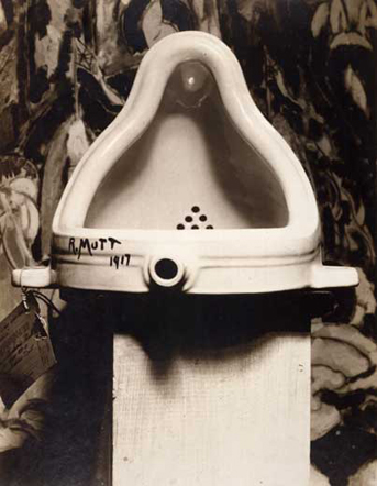
                My response for this week is Marcel Duchamp’s “Fountain.” It’s perfect! I mean he took a freakin urinal signed it and make precious. It is like the opposite of Fedorov what did. Instead of making a something precious a commodity, he made a commodity something precious. And pissed off a lot of people in the process as well. And a century later, we still talk about him.

Thursday, February 17, 2011

Entry 6

                This was one tough week. I really found it hard to grasp a lot of the material. I’m gonne give it my best shot and hope I do a good job.
                Our guest speaker for this week was Carla Bengston who is the associate professor of painting and drawing here at the UO. I was excited when I heard its going to be painting week because I see myself as a painter and was excited to see a professional in that field give a lecture. I was disappointed to see that most of the work was not painting but nonetheless enjoyed the presentation in general. What really caught my attention was when she ask “Is a work more powerful it is political or more subtle?” In my opinion, I think that work that is more political is less powerful than work that is more subtle. This is because I think the author takes the spotlight and usually I forget about the actual piece. While work that is not political tends to take a life of its own and the artist is left in the background.
                In the end Carla showed us some of her work and it fascinated me because it was “unplanned.” Her ant paintings I thought were very original, I have never seen something like that done. And then to recreate them large scale made them seem so abstract and just fun to figure out the movement and path of the ants took. Another piece I liked that she did was when she caught up tiny pieces of paper and threw on the ground to have them interact with the ants. I liked that piece because it was something that Carla had no control over, and the piece itself took a life of its own. It was interesting to see the interaction and controversies the ants had with the pieces of paper.
                The reading for this week was torture. I read it, and read it again. Instead of things getting clearer, they got hazier. However, I did understand the main point the author was trying to make. Roland Barthes was asking the question of whether a piece of work can stand on its own merit or does it really matter what the author/artist think? What I understood is that the artist or author does not hold the key to interpreting the piece. And as soon as the viewer interacts with that piece and develops their own meaning of it, it does not matter what the author thinks; thus the author dies. I found it ironic that Barthes writes this piece of work explaining how the author dies, and when I read it he died. I might have interpreted it wrong and thus what he thinks is no longer relevant.
                Finally, our featured artist for this week is Kiki Smith. Smith is a sculptor and drawer. Looking through her work I found that it had a lot to do with human interaction with animals. When I was watching one of her videos I really like her explanation of what is art. “Art is something that moves from your insides to the physical world.” I can relate to that because I have a hard time expressing myself with words. “It’s like standing in the wind and letting it pull you whatever direction it wants to go.” I agree with her. I think the best kind of art is unplanned. You start with an idea, and as you begin creating you discover something a lot more interesting and decide to go with it. Even though I like her thinking, I dislike her work. I found it discomforting because a lot of it had religious themes and death. I didn’t like because its stuff I have seen before from other artists. I didn’t find anything that I would look at twice. Perhaps I misinterpreted it, perhaps not. I’ll never know.
                Ok now to put everything in a nutshell. A really big nutshell. Everything that I talked about is interrelated. “The death of the Author” is echoed by both Carla and Kiki. The way I interpreted Kiki’s work and the discomfort I felt was because the artist is dead. What I felt and what I thought could have been something totally different than what Kiki intended. When Carla asked the question about what makes a piece powerful, my opinion took a life of its own. Looking at Carla’s work, I found it to be playful and original. The guy sitting next to me may have disliked it. Carla may have been making a political statement. It doesn’t matter what we all think, what matters is us, and how we feel; everybody is dead.
                I also found that Carla's and Kiki’s ideas are very similar. Kiki said that art was like standing in the wind and to let it guide you. This was exactly what Carla did with her pieces. She just went with it. She did brush of the ants, she made the ants the artists and just went with it. The piece with green papers would have failed if the ants to take part of it. It is the unplanned that makes things special.
                 My visual response is a Natalie Dee Comic. I can never tell her tone or what she means with her comics, which sums up what I was trying to say above. And I think I'll leave you hanging with this awkward comic. 

Thursday, February 10, 2011

Entry 5

            Our presenter for this week was John Park. I really liked his presentation because it was engaging and because I can relate to him. He said that he used to sit where we sat in the same lecture hall, and it just was so motivating. One of the key parts to his presentation was when he began to talk about the problems of technology, specifically the zombies part. I totally agree with him, that we as a human species are becoming less human and more robotic. I for one don’t like where we are going. Technology is developing at an exponential rate and we have become so dependent on it. When I really think about it, we really are living in a zombie apocalypse. Every day when I walk down 13th, I dodge people who are not watching where they are going because they are texting; once I even saw a dude on a bike texting- with both hands. I wanted to throw my shoe at him. When I go home, my roommate is staring mindlessly at the TV playing some online game on the PS3. They are everywhere. Sure, I use technology but I regulate it. I’m just glad they don’t have a craving for brains. Sometimes I wish for more human interaction rather than texting someone or facebooking them. We are a very social species, we need to interact with one another rather than with a piece of plastic.

                That being said, I don’t mean to say that technology is bad and that we should go back to the dark ages. If used correctly, technology can not only be useful but it can be something beautiful. Something that can make one more human simply by reminding them that they are human. I know what I said was vague, but this is what I felt when John showed us a piece called “I Want You to Want Me.” This piece really moved me because it was so “human.” It was truthful, it showed what men and women really wanted in each other. “In online dating profiles what people do is they talk about themselves in maybe 200 words and they say the most important things about themselves. And so it is a very fertile ground for building a mosaic of humanity.” I thought that was very beautiful. Living in a world where things are not what they seem (ex: make up, photoshoped images, cosmetic surgery) one forgets that they are human and that they have human feeling and needs. I believe that there is a lot of good in the world, one just has to look for it. One can argue, that people can lie about what they say in their profiles, but I think that if one goes on an a dating website, they are really looking for someone because they gave up looking physically. Profiles may be stretched a bit but I think of it as a snapshot of what people desire. It fascinates me.

                Our artist for the week is David Byrne. He has a very interesting installation called “Playing the Building.”  The work is composed of an organ that is attached to a building’s pipes and columns. When the organ’s keys are pressed, it interacts with the corresponding part of the building making various sounds. I really like this piece because it is so clever! It pushes the boundary on what is art. Is the installation the piece of art? Or is it the music being played by the consumer the art? Both maybe? It makes me think and I like pieces that do that. It reminds me of Andy Warhol when he said that in the future everyone will be famous for fifteen minutes. It’s true, when people sit and play the piano they become famous for a little while. I can also see a connection here with John Park and how technology can be used as a form of art. It reminds of the Dj table that he showed us in class. I find that “Playing the Building” and the Dj table (I can’t remember the name) are similar because they are both a common object that has been altered to make it interactive, fun, and beautiful at the same time. These kinds of interactive pieces really bring out the humanness inside us. In his interview Byrne said “I believe we have an innate longing for the spiritual and ecstatic. If we're not getting it in church, synagogue, or temple then eventually we'll locate it elsewhere: at a concert, a rave, Burning Man, or through sports or drugs, or even through some kinds of art.” This search for a greater power is what makes us who we are, makes us human. We just need to be reminded of that.

                Finally, our second artist for this week is Janet Cardiff. Cardiff was different than everything I have talked about. I found her work to be very creepy and spooky. Especially her audio walks. I listened to an audio walk called “Ghost Machine” and it freaked me out. Her voice is so eerie, especially when she whispers. I always feel something loud and scary is about to happen, but never does. It was very suspenseful. I also watched an installation video called “Pianorama.” This installation reminded me of David Byrne’s “Playing the Building” because they were so similar, yet so different at the same time. They both involved a musical instrument and they both played music. However, Byrne’s was a lot more lively and I associated it with humanness and life. On the contrary, Cardiff’s I found to be rather ghostly. When the keys are struck, two voices can be heard discussing a music composition. Their voices are there but their bodies are not. It reminds of death and how transient this life is.


                My visual response this week is an interactive installation called “Wooden Mirror” by Daniel Rozin. I really thought this piece was amazing because it is playful and creative. Who would of thought wood can be used as a mirror? It echoes John Park and the two artists in a sense because it requires consumer interaction, the art piece itself creates ephemeral art (one’s reflection), and it uses technology to make art.

Thursday, February 3, 2011

Entry 4

Well I have to say that this week has to be the most depressing one I’ve had in this class. We focused on photography, and photography always leaves me depressed. Photography is very powerful, but for some odd reason, only the powerfully devastating images are embedded in my mind. And as I expected most of the things I saw this week were depressing- gut wrenching in some cases.

Craig Hickman was our guest speaker for this week. He specializes in photography. I have to be honest; I did not like how he presented. He did not have a slide show and so he relied on the internet. It was hard for me to follow him since his transitions were abrupt  and I didn’t really get a good grasp on the topic. However, Hickman showed us many photographs that I found very interesting. One that really stood out was the picture of the twin girls by Diane Arbus. "Identical Twins, 1967" was a photo by Arbus that was so captivating. There is just something uncanny about it and I can’t place a finger on it. When I look at this piece I get a feeling of discomfort. The girls look you dead in the eye and they have that expression that says “Yeh… the coffee you’re sipping… Yeh we peed in it.” The discomfort I’m feeling is what draws me closer to this picture, I can stare at it for hours.

What I learned from Craig’s presentation was something’s don’t have to be explained. He just bombarded us with an array of photos. Not having something explained by someone else makes me conceive my own opinions effectively. For example, I may hate a piece of art but then someone comes along and makes sense out of it and suddenly it’s a masterpiece in my eyes. I think that I was manipulated to share the same views as the person explaining. So Craig gave me the freedom to like or dislike many of the pieces he displayed.

Errol Morris talks about this more about this in his blog. The explanation or the caption to a picture really has an effect on how one views an image. In midst of the blog, Morris describes photo’s presented by Colin Powell to justify the war on Iraq. My first impressions of the photos was that they seemed something from the military and they were unclear. There were captions labeling things in the photo with words like “decontamination vehicle” and “chemical munitions bunker.” I instantly get a feeling of panic and red flags shot up. As I scrolled down, the captions changed to “International House of Pancakes” which made me laugh. Instantly, I went from a state of discomfort to a state of joy.I’m not an aerial intelligence expert. I could be looking at anything. It is the labels, the captions, and the surrounding text that turn the images from one thing into another.” This made a lot of sense to me and it explained how I felt. Morris goes on to say, “But I do know that the yellow captions influence how we see the pictures. “Chemical Munitions Bunker” is different from “Empty Warehouse” which is different from “International House of Pancakes.” The image remains the same but we see it differently.” This is echoed by Craig Hickman’s presentation, if Craig explained the photographs I’m sure I would have had a different opinion about them. As humans, we are emotionally sensitive. It’s funny how a few fabricated words can justify war.

Moving on towards to more depressing issues, our artist of the week is Alfredo Jaar. Looking through his work I can see that it is about society and politics. His work titled “The Rwanda Project” is one that really grabbed me by the throat. It consisted of 21 pieces that took him six years to make; and they all failed. He says “basically, when we say one million dead, it’s meaningless. So the strategy was to reduce the scale to a single human being with a name, a story. That helps the audience to identify with that person.” I totally agree with him. Numbers are meaningless. Open today’s news paper, some thousand people reported dead, another hundred died in another tragedy. I just got immune to it. I know it seems heartless but every time you watch the news and every time you turn a newspaper page it smeared with blood. I got used to it. But when I hear something happen to a single person, it’s something different, I sympathize with that person. I feel sorrow towards them. It is kind of like how Errol Morris stated “You don’t need sophisticated digital photo-manipulation. You don’t need a computer. All you need to do is change the caption.” In this case, Jaar decided to manipulate the public’s emotion by focusing on a single person rather than a large number of people. Jaar’s piece “The Silence of Nduwayezu” is about a boy who watched his parents get murdered with a machete. I don’t know what to say. I don’t know how to react. This is really hard to express. I think Jaar did a good a job in communicating what he has to say. He created a mound of one million slides of Nduwayezu’s eyes, and his eyes do the talking. The mound as a whole can be seen as a single work. The dark ambience makes me see it as accumulation of sin, of blood, and death. I tried comparing this with Craig’s photo’s but Jaar’s is way too serious while Craig’s is more curious and innocent.

Now I think it’s my turn to share some images that have been burned into my eyes. Whenever the subject matter is mentioned, the corresponding image manifests in my head. Let’s start early, 1989 in Tiananmen Square. A massacre occurred there where large number of people were slaughtered. The corresponding image would be the famous Tank Man. All I can say is “damn the dude has balls of steel.” A very inspiring image indeed. A few decades later, Palestine, A boy throws rocks at a tank. Let me say that again, a boy throwing pebbles at gagillion ton, man-squashing, shell-shooting tank. I don’t know where to start. What the hell is the photographer doing? Why isn’t he getting that kid to safety? Why is that tank going to kill a little kid? What is the kid thinking?! I don’t know what to say or how to react! So many questions not enough answers. Finally, December 17, 2010, Tunisia, a man lit himself. A response to the oppressive Tunisian government. His actions ignited a revolution, forcing the Tunisian president to go into exile. This revolution ignited the Egyptian protests going on right now. A man lighting himself on fire, changed the lives of millions of people. 

Photos from: